
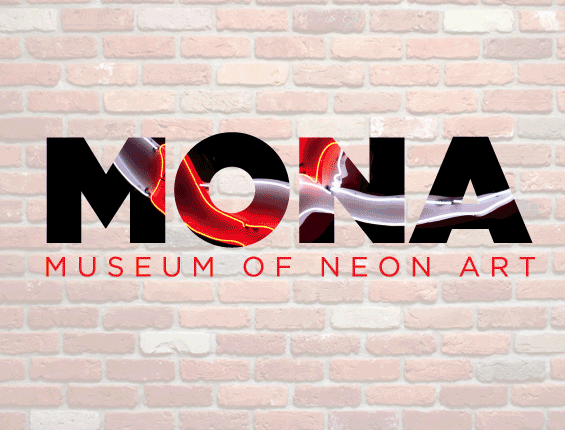
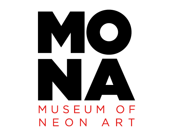
MONA Museum Of Neon Art
Challenge:
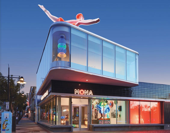
Our client, MONA, or the Museum Of Neon Art, in Glendale, California needed something electric! The Museum of Neon Art encourages learning, curiosity and expression through the preservation, collection and interpretation of neon, electric and kinetic art. Before opening its new standalone location, museum leadership wanted a new brand identity for the organization – something that would really light up and spark visitors to the return again and again.
Solution:
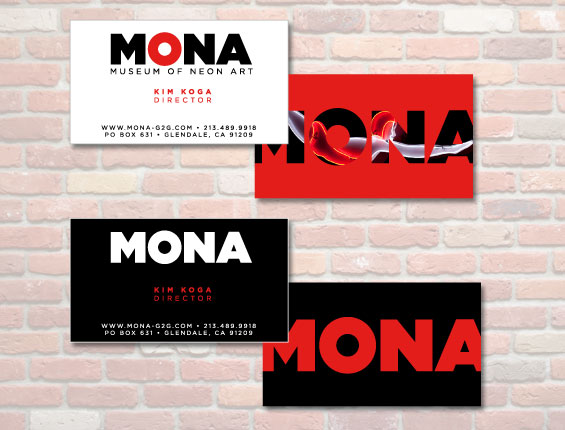
HitState created a brand identity for MONA that was not only bold and bright, but one that could also highlight the Museum’s current and upcoming exhibits. We did this by silhouetting images of upcoming events and installations in the MONA logo so visitors can see what’s coming next. See below right MONA logo for examples.
Results:
The client continues receiving much praise for the identity and use it regularly to promote upcoming events, new installations and shows. It stands as a visual beacon for their brand. Visit MONA in Glendale or online at neonmona.org.
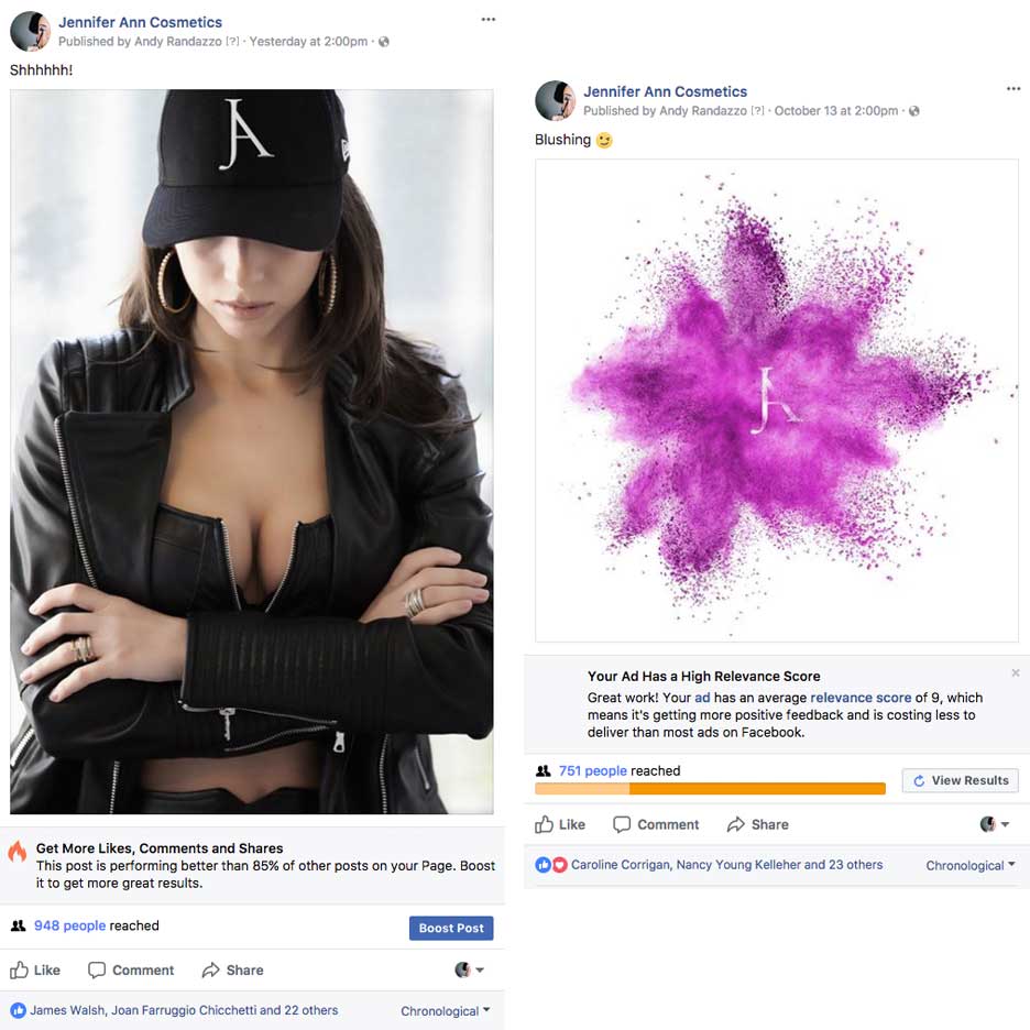
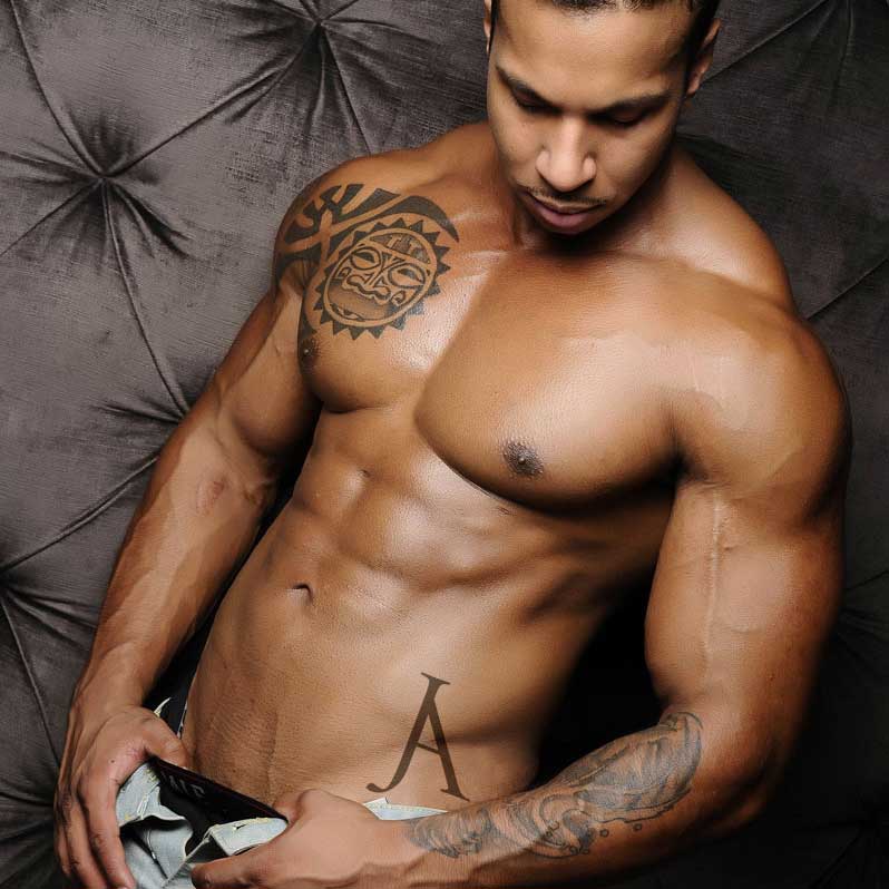
JA Cosmetics - Social is soooo SEXY!


Challenge:
Social is Sooo Sexy! With the upcoming launch of their new website, our client JA Cosmetics wanted something to entice new and existing clients alike. Something that would start a bit of a stir/buzz and get people talking. JA Cosmetics provides professional and expert makeup applications in the bridal and fashion industry for over 15 years and has developed an amazing line of cosmetic products that they will soon be launching on their new site.
Solution:
So what we did is added the new JA band logo everywhere we could think of… even the SEXY places and asked viewers to see if they could find the JA. We wanted something interactive that would engage users. Some of the images were more provocative than others to get the reactions we wanted.
Results:
The response and engagement was amazing! JA’s Facebook and Instagram pages have been getting 100x more feedback, likes, comments and shares than ever before. Coupling that with a few new monthly promotions and offers… it is going to get “HOT IN HERE”. Like we said… SEXY!!!
See if you can find the new JA brand logo in these images below.
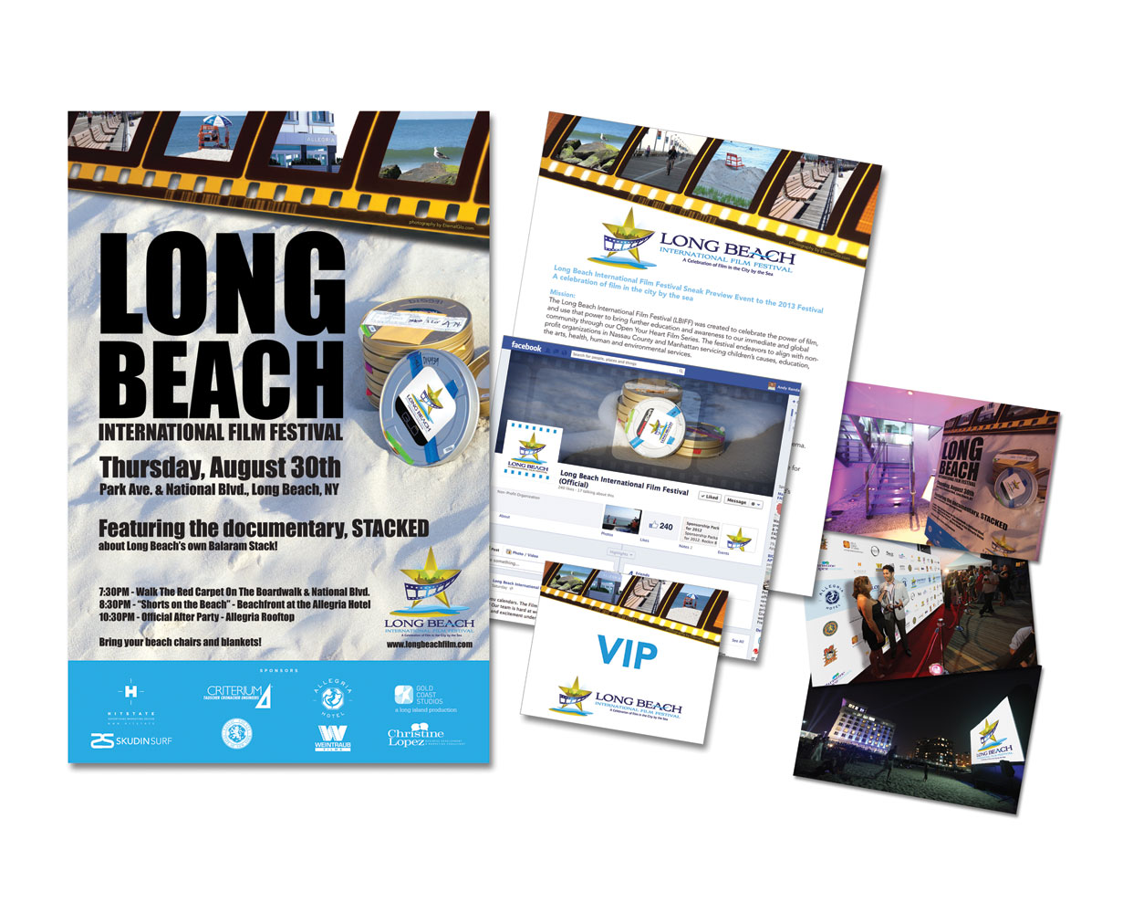
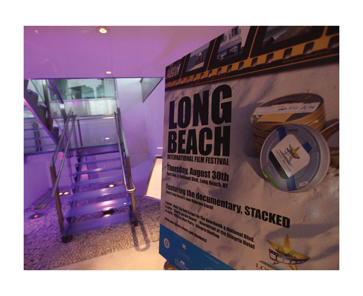
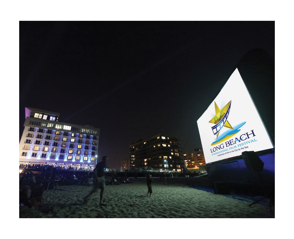
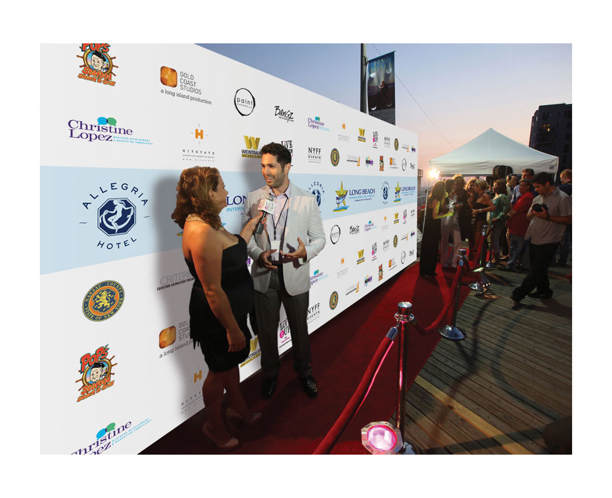
Long Beach International Film Festival
Challenge:
Long Beach International Film Festival team was planning their kickoff event on the beach in Long Beach, NY. This was a brand new concept and LBIFF needed to create awareness around the event, attract film makers, sponsors and attendees as well as rally support from the community.
Solution:
Our marketing team worked side by side with LBIFF to create buzz around Long Beach and surrounding communities about the event. We developed and managed their social media properties as well as their web site, created posters that hung in local store fronts, flyers, postcards, press kits, 1 sheets and a sponsorship deck that was presented to Nassau County Executives as well as Long Island business owners.
Results:
LBIFF received over 10 different company sponsorships and grant money from both Long Beach and Nassau County to run the event. The event was at capacity with guests and celebrities for the festival and after party at the Allegria Hotel. There were over 600 local attendees on the beach, social media engagement with attedees sharing video and pictures throughout the event with a branded hashtag. The festival was covered by local media and politicians which not only expanded awareness of the event, but also the message that Nassau County is desirable location for filmakers.
CTIT

Challenge:
CTIT (Columbia Tri-Star International Television) had a very old and out dated brand that looked too corporate and stale for exciting line up of shows that they had. And they have been doing this for years and could not get out of their bland brand rut. And in turn they were not getting a response from their products.
Solution:
We wanted to really have them stand out from their competitors and really make their line-up wow their clients in the simplest way possible by using one strong image and one word describing the product with a number of striking colors used throughout. This campaign concept carried throughout every bit of creative, advertising and collateral we created for them.
Results:
Clients were bowled over by the new fresh look at everything they received and shows they attended. It was so different and refreshing than anything else from any other company at the trade shows they attend. CTIT really stood out from everything else that was out there. Sales of their shows and interest of their products increased.
Additional Results

"We are a local Long Island restaurant with 3 locations. With 1 Facebook ad campaign HitState created for us we saw an increase in foot traffic of 300% to all 3 of our location in the very first week!" - DID YOU KNOW... most guests (78%) find restaurants to try based on recommendations from their friends... and most of those recommendations come from friends online and on social media through Facebook, Google, Yelp and many more.
Local Restaurant Owner

"Being a local NY Yoga studio one of the most important things we need to do is make sure we are bringing in new customers. With one blast campaign HitState created and sent out for us brought in 15 new customers that purchased individual and packages & sessions for a total of $1,575 in he first 2 weeks of the mailing and that's not including how many more resigned for additional months with us."
Yoga Studio

"We wanted to present an offer to new and existing customers of a new inexpensive light plastic surgery service. HitState created a brilliant eblast campaign along with Facebook ads and landing pages that brought in 23 new customers and brought in over $27,000 that month alone."
Local Plastic Surgery Client

"Having HitState taking care of the digital marketing for our high end real estate properties has been such an amazing experience. We never dreamed of the results we were able to get in such a short period of time and then over the long term with the right strategic planning. It is a "well worth it" investment that we now put int our monthly budget. Thank you for all your advice, ideas and for being passionate about our success!" - Maria Stepnowski
LA Based Celebrity Realtor
Creds
People say a lot of things. Here are some of the good ones they are saying about us.

Where to start about Andy... he knows enough context about seemingly everything to cut to the hearts and minds of people, their business and interests. He brings a level of creativity and passion to his work that I found unparalleled to others. We tapped into Andy's skill-sets to help us boil-down very complex issues and facts into a one-pager that was easy to digest. The work products he shared were of excellent quality. EY has on-boarded Andy and HitState to support with any projects where we need his insights, guidance, and creativity.
Frank Traina - Executive Director at EY

HitState helped us roll out a complete company wide re-brand with great success. From our new logo design to our new website, we are extremely happy with the results. Andy and his team were professional, responsive and most importantly they brought a level of creativity to the process that we were lacking. We are now moving on to outbound marketing and trade show exhibits. We look forward to continuing our work with HitState and certainly recommend them for any business needing their services.
Brian Selltiz - Owner at Digital Provisions, Inc.

I invited Andy to speak to my Marketing Networking group recently to talk about branding. His presentation was knowledgeable and thorough. Many of my group members thought it was well done and allowed for a lively discussion. I'd invite Andy again to speak if the opportunity presents itself.
Larry Drago - Marketing Manager beyerdynamic, inc.

I hold the Office of President for The New York City/Long Island Chapter of The New York State Commercial Association of Realtor. I was introduced to Andy in 2017 and asked Andy for a quote for building our Chapters new website. Andy was competitive in his quote and it was his attention of service that had me decide to go with his firm. He was timely and professional and turned out a great product.
Jack Britvan - Owner, Commercial Realty Services of Long Island

We worked with several different marketing companies until we met Andy. He guided us every step of the way and took the time to explain what really resonates with prospects. In over thirty years of working alongside marketing professionals, Andy is the best I have ever seen. His energy level is only surpassed by his creativity. You can instantly feel that Andy truly loves what he does as his passion comes through time and time again. Andy was a great find for our company and has contributed to our success in so many ways and is still doing so. Thanks Andy!
Pete Noonan - Vice President Sales at Digital Provisions, Inc.

Andy designed the logo and branding for Dr.Bwell, and has helped my practice in more ways than I can imagine. He's creative and detailed oriented, which makes him great at what he does. I always consider using Andy first when I'm in need of web design and company branding.
Dr. Barry Heffron - Owner, Dr. B Well Chiropractic Health & Wellness

Andy adapts his visions to the needs of his clients to produce outstanding work that is guided by his knowlege and experience yet still allows the "vision" of his client to exist. He is wonderful to work with as he is, responsive resourceful and always on-schedule and on-budget.
Consuelo Eckhardt - CE Consulting

Andy has incredible creative approach and has made a difference in my company's branding with logo design, marketing ideas and website impact.
Jason Kohl

Some of our clients: